I recently returned from a professional conference, where I sat through over two dozen hours of Powerpoint presentations. It was obvious that my colleagues were knowledgeable and well-prepared. However, from an audience member's point of view, many of the presenters could have done a few simple things with their slides to improve their delivery. I'm not referring to advanced graphic artist skills, but simple commonsense tweaks, which I'm going to keep in mind for my next presentation to professional audiences. And I hope you will too.
The content on the following sample slides is from NIMH (which you are free to use without copyright restrictions for your website, blog and other writing):
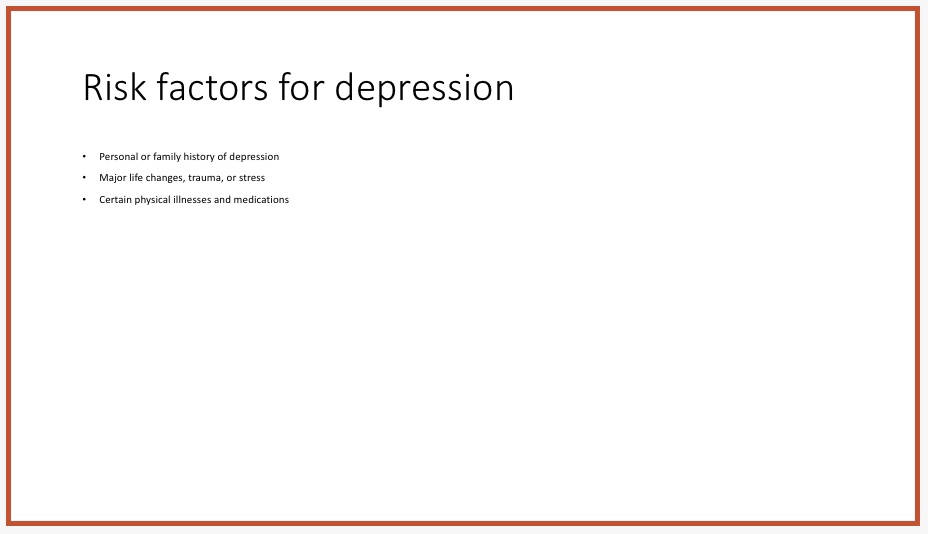
1. Use big font on slides
Even when there is plenty of room on the slide, some presenters bunch the content together in tiny font, using less than half the space. Imagine trying to read this from the back of the room.
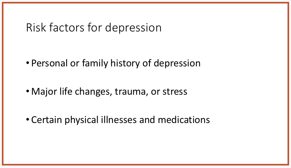
Here is the same content, but with bigger font and double spacing between bullet points. It's obviously easier to read on your screen, but it makes an even bigger difference for your live audiences. Powerpoint's default font size seems to be 28 pt. I aim for 32 pt on most of my slides. You can change the default font size in your Powerpoint program by modifying the slide master of your presentation. It's under the View menu.
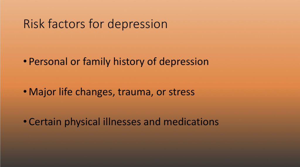
2. Use high contrast between your text and background
This is particularly important when the room is dimly lit. At my recent conference I strained to read text on slides that looked something like this:

Some experts advise using dark font on a light background, while others recommend light font on a dark background. But several factors contribute to readability, including room lighting, room size, screen size, image projection size, and viewing angles. You probably won't know these variables until you get to the room. If you really want to cover all bases, prepare your presentation with both types of background. But in most cases, that's not necessary. As long as the font color contrasts with the background and the font is large enough, your audience will probably be able to read it.
3. Keep slide background simple
Newer versions of Powerpoint provide uncluttered slide designs ("themes") that don't compete with the content of one's presentation. However, some have design elements at the sides or bottom, which reduce the size of the area for your content. That may be a good thing, forcing you to use fewer words (NOT smaller font, please!) to get your message across.

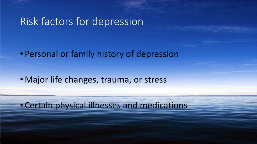
Slide backgrounds can be customized with gradients that move from light to dark. Text on such slides may be difficult to read, due to low contrast in some areas, as shown below. Step back and try to read the last line.
It can be even worse when you use an image as the background:
4. Use images, but wisely
Images are not just decorative. When relevant to the content and non-competing with the content (unlike the image above) they facilitate audiences' interest, and in some cases, emotional connection. For example, when viewing the slide below, you probably experience more empathy or concern, than you would in reaction to the same slide without the image.

5. Less is more
It sometimes seems to me that presenters copy and paste content from their articles onto a slide. Imagine trying to read this on the screen, even at the front of the room. Not only is the font way too small, but your eyes have trouble tracking the lines of text. Presenters who use slides like this, often turn their back to the audience to read what's on the screen, or they read from their laptop. Both these options disengage you from your audience - which makes them more likely to disengage from you.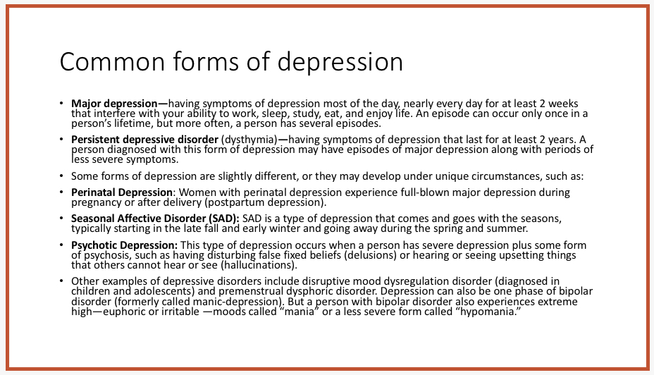
In order to stay connected to your audience, put just bare-bones heading-type information on the slide, and explain it point by point in your own words. Of course, that means you have to thoroughly know your material.
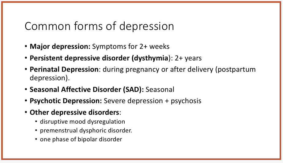
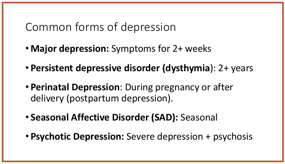
The slide above is easier to read than the one before it, but it's still a bit cluttered. Your audience will have an easier time processing the content if it is split into two slides. This enables you to use fewer lines per slide, which looks cleaner and is easier to read. Moreover, clicking from one slide to the next tends to grab the audience's attention.

6. Present data in charts or graphs, not tables
Here are some US government statistics on teens treated for depression, presented in table form. Notice that even with just a few lines, it would be difficult, if not impossible for people at the back of the room to see the numbers. Rule of thumb: If you have to preface your description of your slide with, "You probably can't read this, but…" DON'T USE IT! 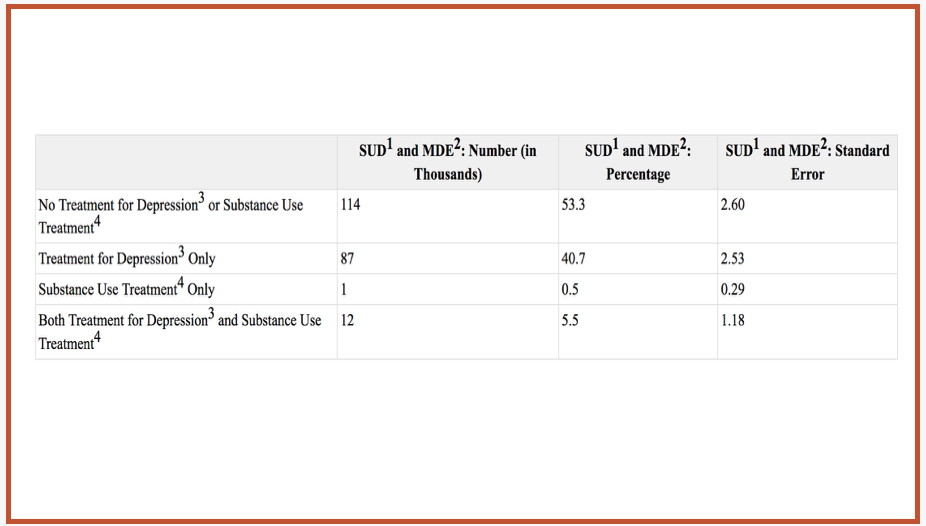
The same data presented in a pie chart communicates the numbers in a much more effective way, don't you think?

7. Hide background images for printing slide handouts
If you provide slide handouts in printed or PDF format, they will be much easier to read (not to mention saving ink) without the background design. Prior to creating a slide handout file, you can turn off background graphics in your entire Powerpoint presentation (or in individual slides) by clicking on "Format background" under the Design tab. Images will still be shown. 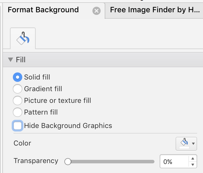
8. More stuff that can go wrong in your presentations
Finally, here's a 7-minute video depicting one of the worst presentations ever. See how many mistakes you can spot. SPOILER ALERT: The presentation is a spoof. Watch all the way to the end for really useful tips.
Other posts related to this topic:
5 blunders that can sabotage your presentation